
Branding Is Not a Logo. It Is a Feeling.
Your customer cannot tell you what your brand colours are. They cannot name your font. But they know within 3 seconds of landing on your Instagram feed whether it matches the business they walked into, and whether they want to follow you.
Social media branding is not about having a design guide. It is about every element of your feed, your photography, your captions, and your Stories working together to create a consistent feeling. That feeling is either intentional or accidental. This is how to make it intentional.
Colour Palette: Pick Three and Stop
Every professional content creator uses a consistent colour palette across their posts. This does not mean every image has the same colour. It means the edit choices, overlay colours, backgrounds, and graphic elements draw from the same set of 3 to 5 colours.
For Adelaide small businesses, a practical approach: take your brand primary colour, a neutral (off-white, warm grey, or natural tone), and a highlight accent. Use these across your Canva templates, your Instagram Story backgrounds, and the editing preset on your photography.
Scroll through 12 of your most recent posts. If you cannot see a consistent colour story in 3 seconds, you do not have one yet.
What consistent colour does: Trains followers to recognise your content as yours before they read a single word. In a crowded feed, recognition before reading is the first engagement.
Typography: One Font for Graphics
Your feed will have photography, graphic posts, quote tiles, and Story slides. Every graphic element should use the same typeface family. Two at most: one serif for headings, one sans-serif for body copy. Using six different fonts across your graphic posts is one of the most common ways small business social media reads as inconsistent.
Choose your font to match your brand personality. A fine dining restaurant should not use a rounded, playful typeface. A children's activity business should not use a thin serif. Your font communicates brand position before the words do.
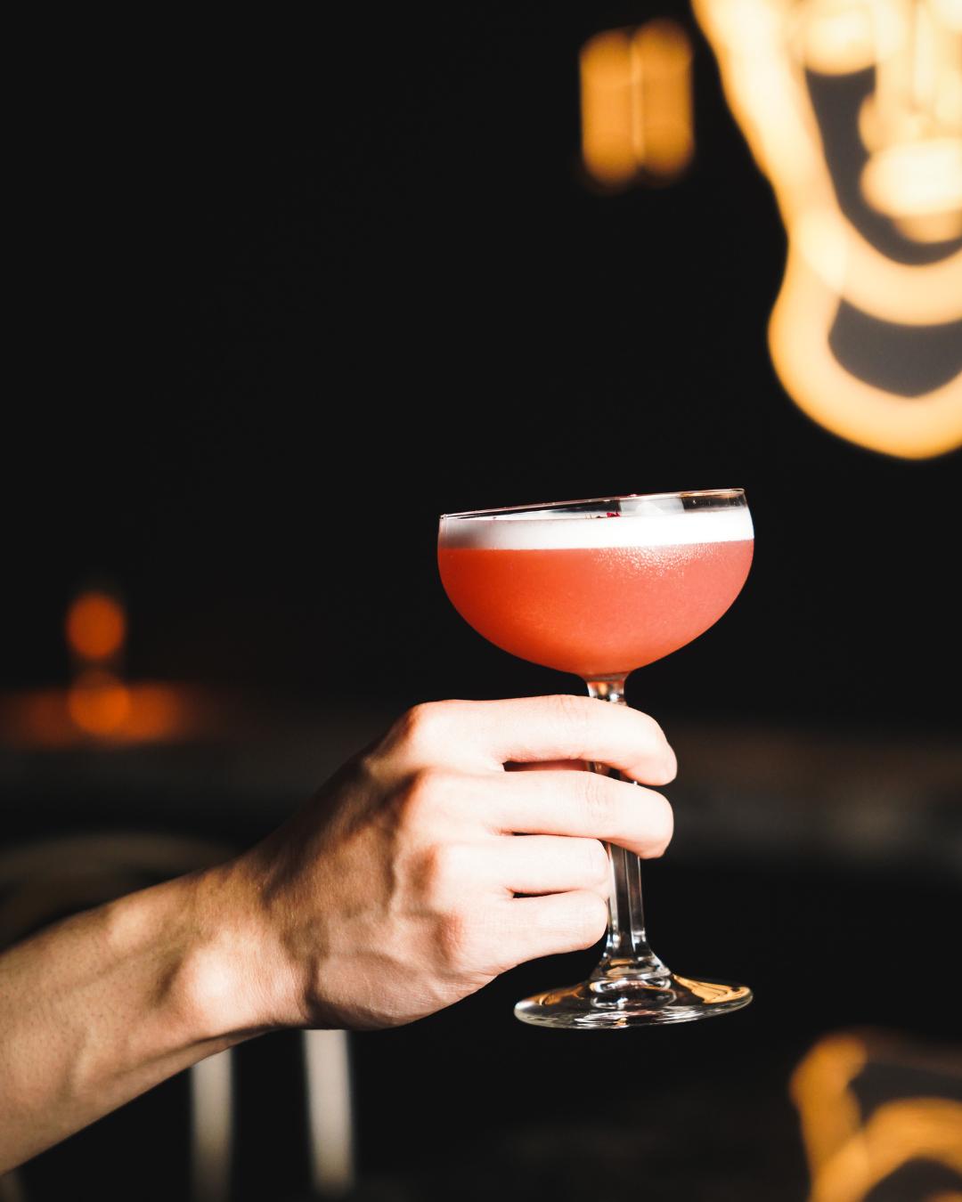
Photography Style: The Most Important Branding Decision You Will Make
For visual industries, photography is the brand. A restaurant, a cafe, a beauty salon, or a retail business lives and dies on photography quality in 2026.
Consistent photography style means:
Consistent lighting. Natural light shoots produce a different feel than studio lighting. Warm tone edits produce a different feel than cool, clean edits. Decide which direction your brand sits and commit to it across every shoot.
Consistent composition. An Adelaide cafe that shoots overhead flat-lays for 6 months and then switches to moody direct-light close-ups looks like two different businesses. Pick a composition style and stay there until you have a reason to evolve.
Consistent subject focus. A restaurant that posts food photography, then lifestyle shots, then team photography with no consistent thread looks like it cannot decide what it is. Lead with food. Add context. Keep the focus clear.

Consistent editing preset. Run every image through the same Lightroom or VSCO preset. Even a 30% strength preset applied consistently creates a brand-recognisable edit signature. Without a consistent preset, each photographer's natural edit style dominates. The feed looks like a collection of separate images rather than a single cohesive brand.
Caption Voice: The Test
Read three of your most recent captions out loud. Do they sound like the same person? Do they sound like your business? Or do they sound like a generic social media post that could belong to any business in your category?
If your captions could be copy-pasted onto a competitor's account with no editing required, they are not doing brand work. They are filling space.
A caption that carries your brand voice:
- Uses specific names, specific dishes, specific staff, specific locations
- Reflects how you actually talk to customers in person
- Has an opinion or a perspective rather than just a description
- Invites a specific response rather than a generic call to action
Highlight Covers: The First Thing a New Visitor Sees
When someone lands on your Instagram profile for the first time, they see your profile picture, your bio, and your Story highlight icons. Those highlight icons are your branding opportunity before the grid.
Consistent highlight covers, same icon style, same background colour, same font if there is text, signal brand intentionality. Inconsistent covers (emoji, stock icons, random screenshots) signal a business that has not thought about this yet.
Highlight categories for most Adelaide businesses: Menu or Services, Gallery, Team, Reviews, Current Specials, Behind the Scenes. Name them to match your business.
Social Media Branding Checklist
| Branding Element | What Good Looks Like | What Bad Looks Like |
|---|---|---|
| Colour palette | 3 to 5 consistent colours used across all graphics | Different colours every week |
| Typography | 1 to 2 fonts used consistently in all graphics | Multiple fonts with no pattern |
| Photography | Consistent light, composition, and preset | Mix of phone, professional, stock images |
| Caption voice | Reads as the same person across all posts | Tone shifts post to post |
| Highlight covers | Consistent icon style and background colour | Mix of screenshots, emoji, no system |
| Profile bio | Clear, specific, includes location or area | Vague or outdated information |
The Compounding Effect of Consistent Branding
Branding on social media is not a one-post decision. It is a multi-month investment. The accounts that look most distinctive in their category did not start that way. They got there through consistent decisions made post after post, month after month.
The first month of consistent branding looks like a small improvement. The sixth month looks like a brand.
A new visitor who arrives at your Instagram in month six should feel, within 3 seconds, that this is a business worth following. That feeling comes from the photography, the colour story, and the caption voice all pointing in the same direction.
Adelaide Socials develops a brand guide for every client as part of the social media management onboarding process. If your feed feels inconsistent and you want to understand what it would take to get it on track, we are happy to take a look before you commit to anything.
FAQ
What does social media branding mean for a small business?
Social media branding means your photography style, colour palette, typography, and caption voice are consistent across every post. A visitor scrolling through your Instagram feed should be able to tell in 3 seconds that all the content belongs to the same business.
How do I make my Instagram feed look consistent?
Choose a consistent photography lighting style, edit every image with the same preset, use 3 to 5 colours across your graphic posts, and use only 1 to 2 fonts in your graphic templates. Consistency matters more than any single element.
Does professional photography matter for small business social media?
For any business in a visual category, including restaurants, cafes, beauty salons, and retail, professional photography is the single highest-impact investment in social media branding. Phone photography with inconsistent lighting, held next to original professionally shot content, is immediately noticeable to your audience. The engagement gap between professional and amateur photography on Instagram is measurable.